
"Hey laura,
exciting - a new space for you! Those look like a real fun, vibrant pairing
(highlights of lime or coral would be beauty accents there too). I would
recommend doing a more 'calm' version on the main part of your walls.. and then
using the real intense saturated versions of these colours in accents -
art/linens/pillows/accessories! If your walls are the strongest version of the
colour... it often gets a bit tiring to have around after a while. I, of course, would use a nice robin's egg on
the walls and then throw in some purple for either an accent wall... or
something fun!
Good luck!"
I looked up Robin's egg blue and I like what I see. It is a calming color and I have a bed spread to match. Here is what I am inspired by:


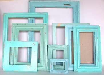

I am open to any feedback about this color selection. I am a newbie at this. I love color, wear it, paint it, decorate with it. But maybe turquoise and purple aren't good wall colors. We will see.
I like what Mel had to say. I too am a fan of painting the walls a light, neutral colour, then doing one bold accent wall, and painting my furniture and using curtains and linens to add colour to the room. It's probably easier to change the colour of a coffee table, rather than the colour of a wall. And being a basement, lighter colours will lighten the space. I LOVE the colours you've chosen, though. Great taste ;)
ReplyDeleteYup, what Jen said.. and.. what I said! lol... this post is total EYE CANDY for me of course, love it! You could even get a bunch of 'cheap' large canvases and do fun colour pops/abstracts to pull those deeper intense colours into the space!
Deletemel
needle and nest design